Outreach
Programs and support moments designed around care, access, and practical help for real people.
Purpose, presence, and personality in one polished home. Tishe is a public figure, entrepreneur, community advocate, and BBNaija hopeful building a brand that feels warm, credible, and ready for bigger stages.

This website now leads with clarity instead of darkness. It introduces Tishe with warmth, lets the photography breathe, and gives partners, press, and audiences an easier way to understand the person behind the public presence.
Community work deserves a visual language that feels trustworthy, open, and human. This section sets that tone while leaving room for more verified projects, stories, and outcomes as they are added.
Programs and support moments designed around care, access, and practical help for real people.
Encouragement and visibility for others through community-facing conversations, examples, and leadership.
Clear storytelling that helps media, partners, and supporters understand the work without noise or confusion.
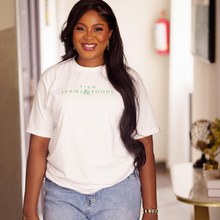
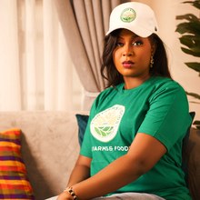
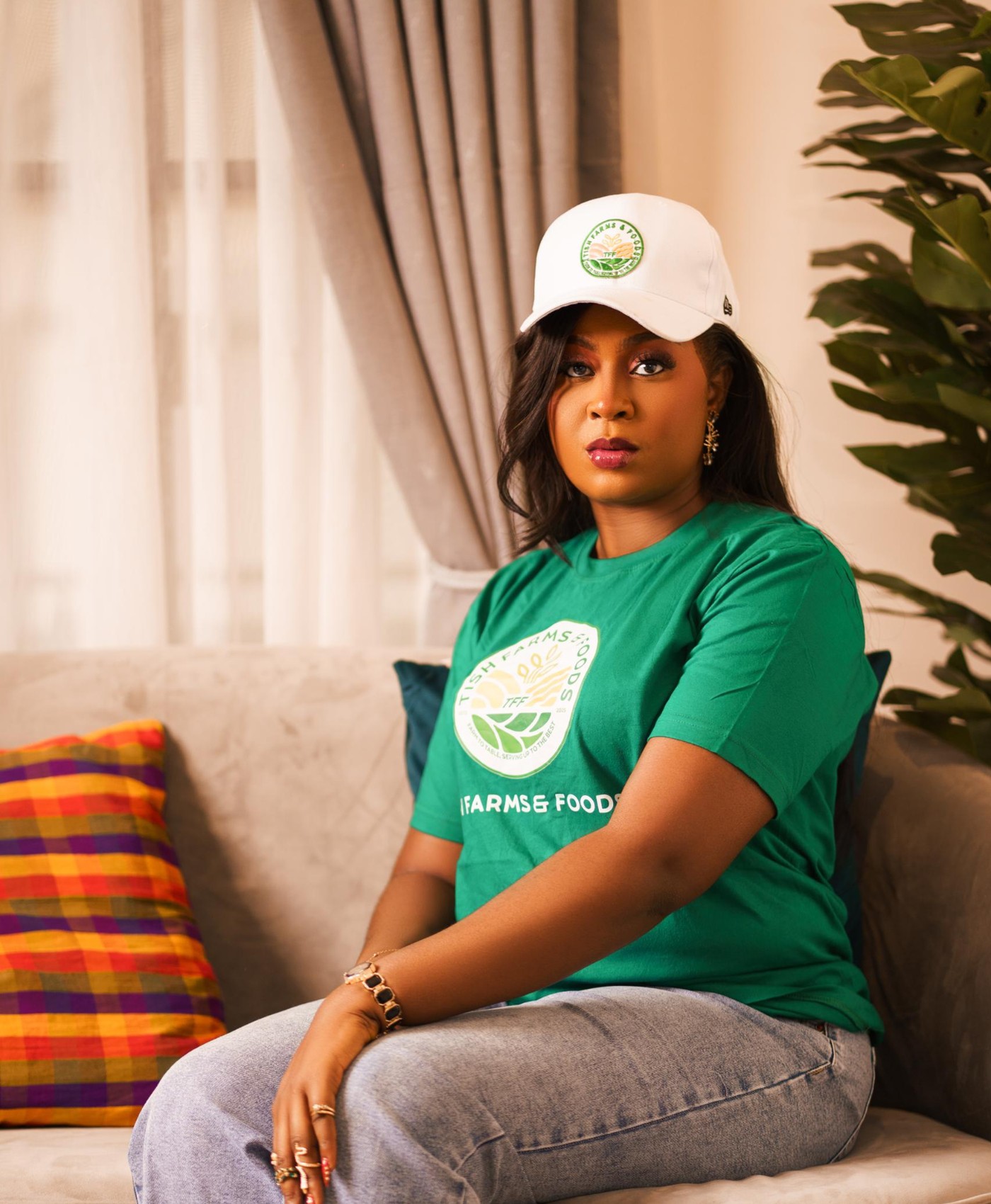
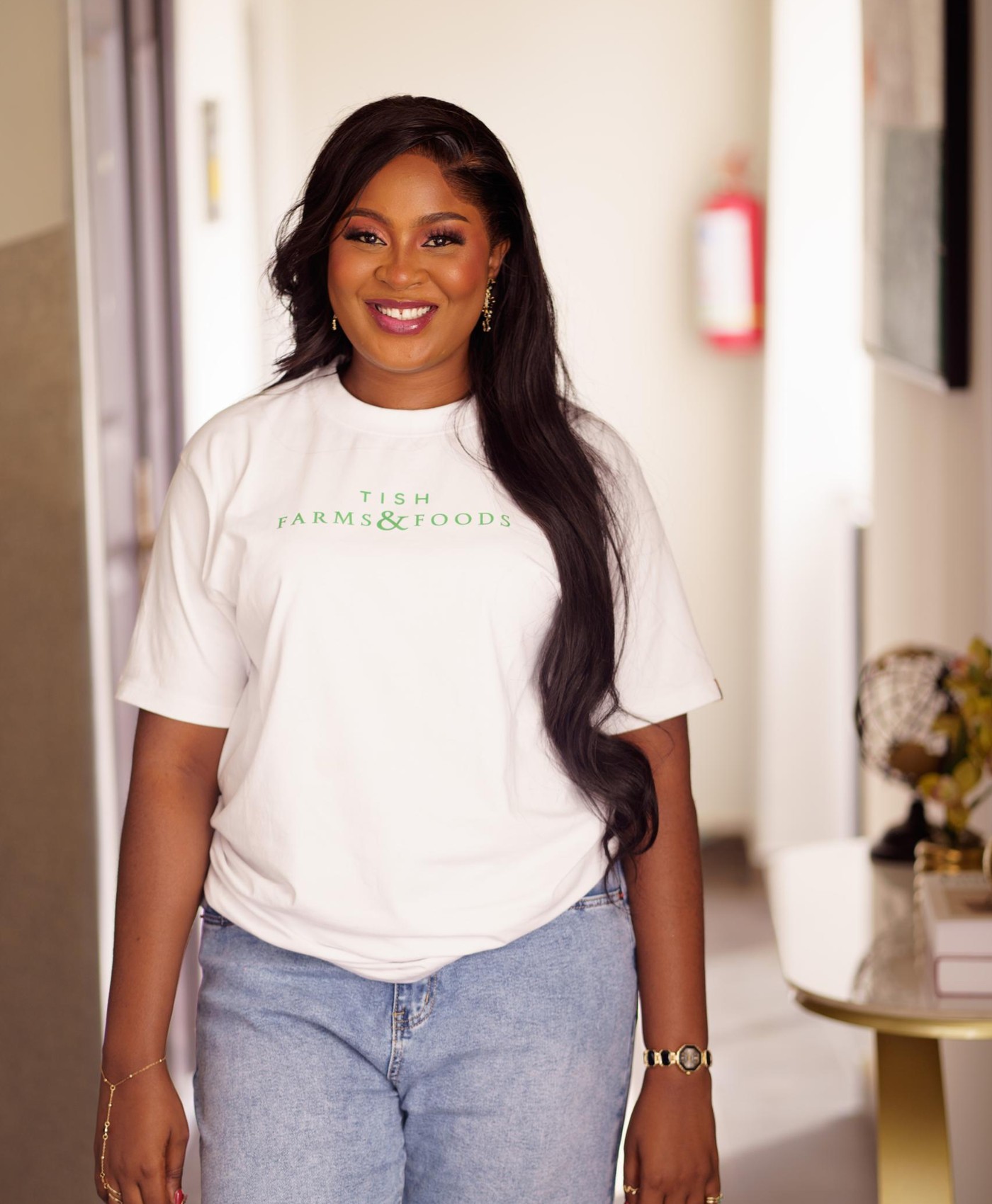
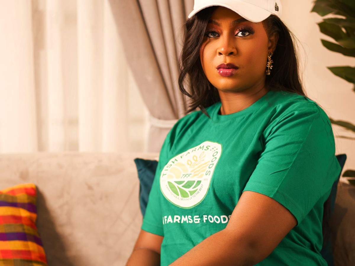
Tish Farms & Foods anchors the ventures story in healthy living, value creation, and community-minded growth. The presentation is cleaner now, so the venture feels more premium and easier to trust.
A featured business built around quality, consistency, and a stronger wellness-centered story.
More ventures, collaborations, and commercial partnerships can now slot into the same brand system cleanly.
Instead of feeling heavy and crowded, this new direction gives media and music space to look curated. It makes room for interviews, features, and releases without losing elegance.
Press-ready features, interviews, and public-facing profile material arranged for quick understanding.
View media pageF.A.I.T.H. becomes a clearer creative anchor, giving the site emotional range without making the whole brand feel dark.
Open music page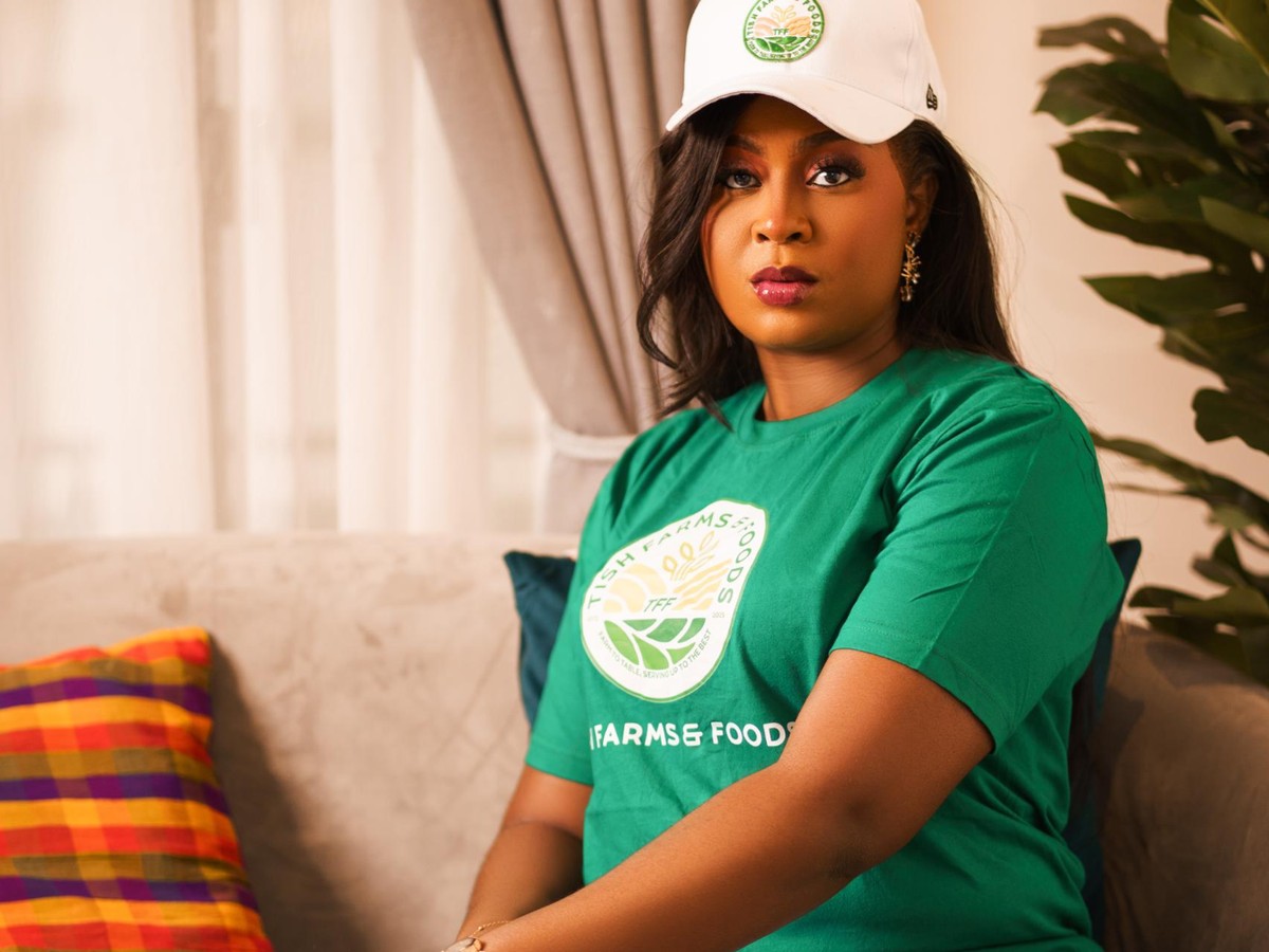

The new visual direction keeps the site feminine, premium, and modern. It is lighter, easier to navigate, and much more aligned with a polished personal brand website.
Warm ivory, soft blush, gentle sage, and muted gold replace the heavy dark surfaces.
Alternating sections, open spacing, and cleaner cards make the site feel designed rather than crowded.
The structure now supports future press links, venture details, music updates, and campaign pages more naturally.